Hey there friend! Let me bring you in on a little secret 🤫 Did you know that your website is more than a digital business card? Like a lot more.. it's your brand's home base, your first impression, your hype person all rolled into one screen. But here's the thing, not every website design style works for every brand. Together, let's figure out which design trend will make your brand impossible to ignore.
Minimalism: Less Really Is More
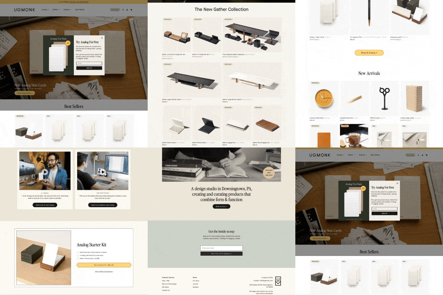
Think clean lines, lots of breathing room, and zero clutter, kind of like how your room should be 🧹 Modern minimalism isn't about being boring, it's about being intentional. Every element on the page has a purpose, and nothing distracts from your message.
Take Ugmonk's website for example. They've mastered the art of digital zen with soft colors, simple layouts, and plenty of white space. The result? Users actually feel calmer just browsing the site (which is kind of the whole point).
What makes minimalism work:
- Lots of white space that gives your content room to breathe
- Limited color palettes (usually 2-3 colors max)
- Clean, simple typography
- Only essential content, no fluff
Maximalism: More Is Definitely More
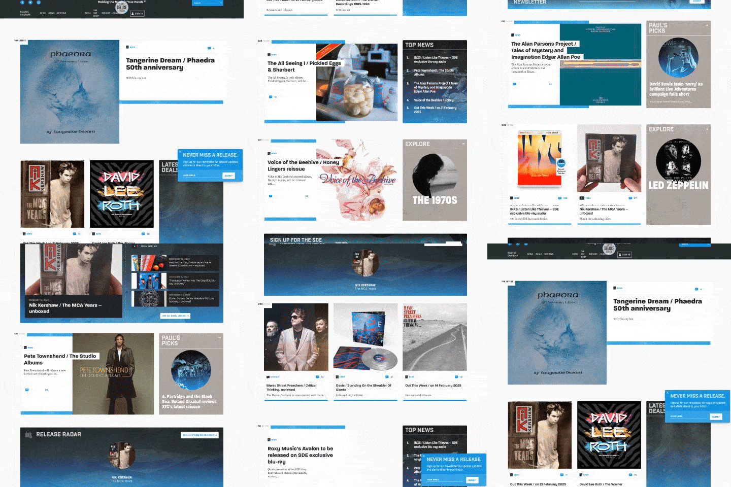
If minimalism whispers, maximalism screams (in the best way possible). This style is all about bold colors, layered visuals, and unapologetic energy. It's not for the faint of heart, but when done right, it's unforgettable. It's like organized chaos, everything needs to feel intentional, not just cluttered.
Super Deluxe Edition is a perfect example. Their website embraces maximalism with vintage album artwork, overlapping graphics, bold typography, and vibrant blue accents that pop against textured backgrounds. It feels like flipping through a collector's record store, and the nostalgic, artistic vibe matches their brand perfectly.
What makes maximalism work:
- Bold, contrasting color schemes
- Layered elements and textures
- Patterns and graphics galore
- Animations and interactive features
- Collage-like compositions
Brutalism: The Digital Rebel
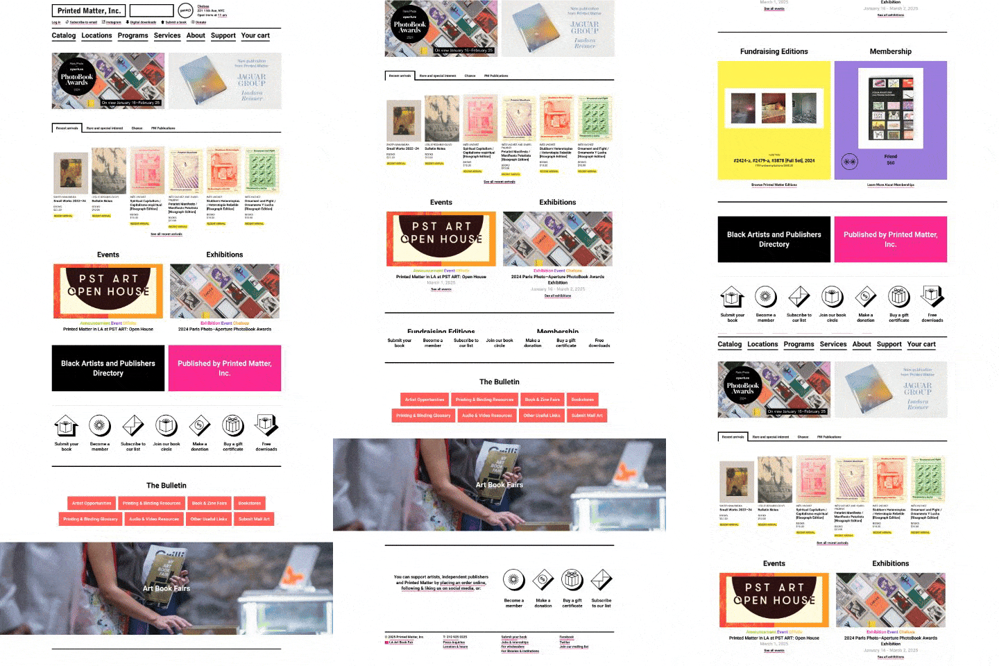
Forget everything you learned about "pretty" websites, brutalism throws the design rulebook out the window. This design style is raw, unpolished, and unapologetically functional. It's not trying to impress you with fancy animations or sleek gradients. It's honest, fast-loading, and refreshingly different in a world of overly polished websites.
Printed Matter nails this approach. Their website features stark black borders, basic typography, minimal styling, and a no-nonsense grid layout. It looks like it time-traveled from the early internet, and that's exactly the point.
What makes brutalism work:
- Raw, bare-bones design
- Monospaced or basic fonts
- Harsh contrasts (usually black and white)
- Exposed structure and grid systems
- Intentionally "undesigned" appearance
- Function over form, always
Neo-Morphism: The Smooth Operator
Neo-morphism (or "neumorphism") is all about creating depth without being obvious. Think soft shadows, subtle highlights, and elements that look like they're gently raised or pressed into the background. It's touchable without being overly 3D.
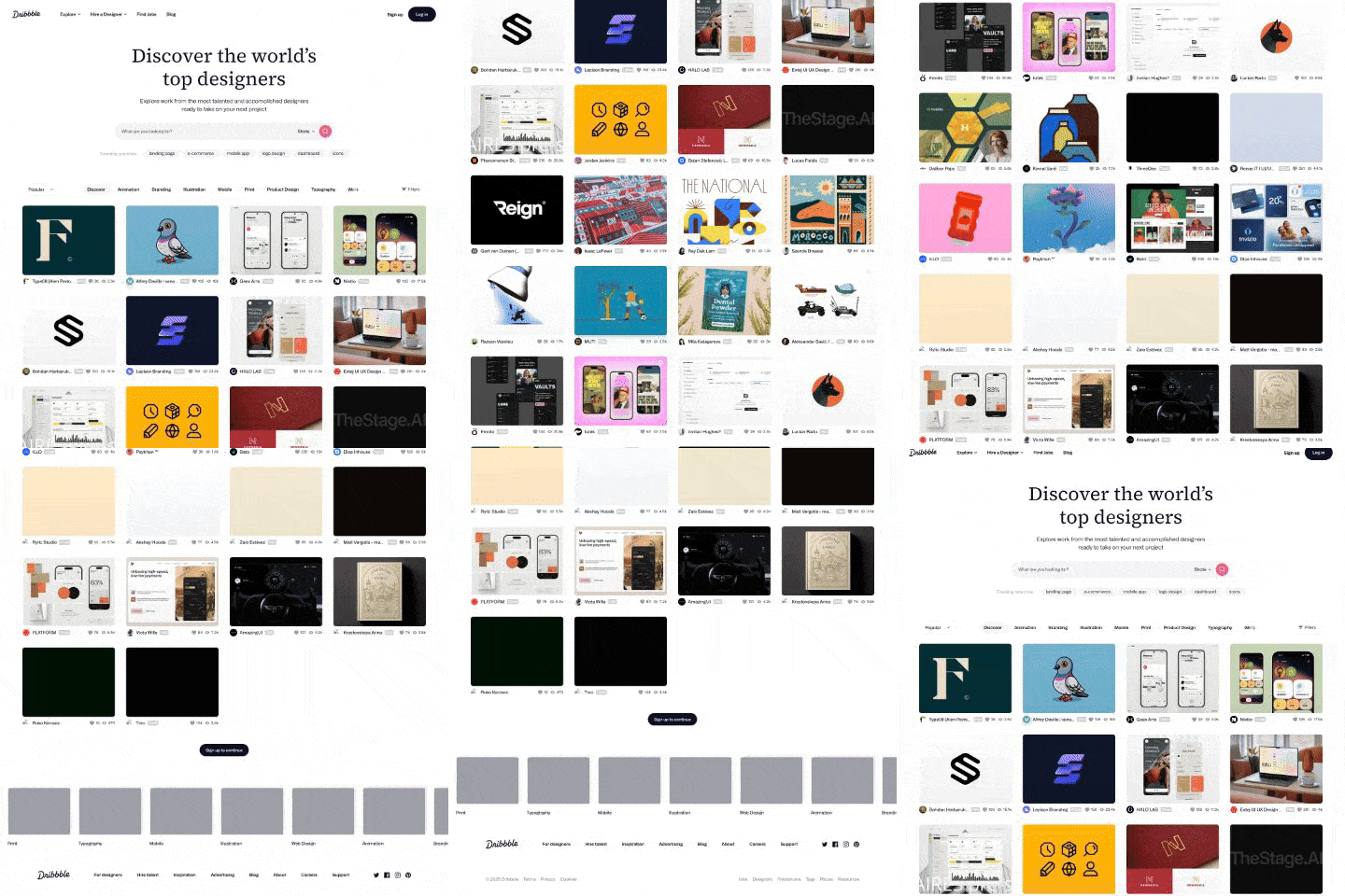
Dribbble showcases this web design style beautifully in design portfolios. You'll see cards and UI elements with soft, diffused shadows that make them appear to float just above the surface. The effect is clean and modern, with a tactile quality that draws you in without overwhelming the content.
What makes neo-morphism work:
- Soft UI elements that appear to extrude from the background
- Subtle shadows and highlights for depth
- Monochromatic or limited color palettes
- Tactile, almost touchable appearance
- Modern take on skeuomorphism without the clutter
How to Choose the Right Style for Your Brand
Not sure which direction to go? Here's how to figure it out:
1. Know Your Brand Personality
Are you bold and rebellious, or polished and professional? Your website should reflect who you actually are, not who you think you should be. If your brand has edge, lean into it. If you're all about trust and reliability, show that instead.
2. Understand Your Audience
Think about what your ideal customer expects when they land on your site. A Gen Z audience might love experimental, bold designs. Corporate clients? They probably prefer clean, straightforward layouts.
3. Define Your Goals
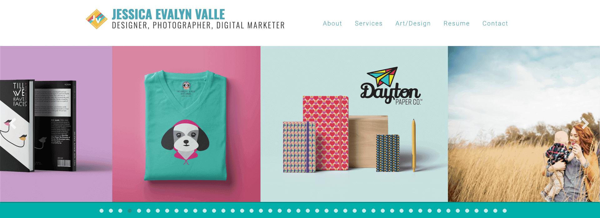
What do you need your website to do? If you're focused on quick conversions, minimalism keeps things clear and distraction-free. If you're showcasing creative work or products, maximalism or brutalism might work better. Let your goals guide your style.
4. Consider Your Industry
Some industries have expectations. Finance and healthcare usually stick with clean, trustworthy designs. Creative industries have more room to experiment. That said, don't be afraid to stand out, just make sure it serves your audience, not just your ego.
The Bottom Line on Website Design
Here's the truth, there's no single "best" website design style. The right design for your brand is the one that authentically represents who you are and connects with your audience. Whether you go minimal, maximal, brutalist, or neo-morphic, what matters most is that it feels like you.
Remember, trends will come and go, but a website that genuinely reflects your brand? Not to be cheesy or anything, but that's timeless 😊 The key is choosing a style you can own with confidence and execute with purpose.
Ready to Build Your Perfect Website?
At Buck Up Studio, we specialize in creating websites that don't just look good, they work hard for your business. We'll help you find the style that fits your brand, your audience, and your goals.
Let's turn your website into something worth talking about. Check out our Web Design services and contact us today for a FREE consultation.
Whatever your business needs, don't sweat it. Buck Up has your back!
