Online forms are the gateway to customer conversions, yet 67% of visitors abandon them before hitting submit. Whether you're collecting leads, processing payments, or gathering customer feedback, a poorly designed form can cost your business thousands of potential customers.
In fact, the difference between a high-converting form and an abandoned one often comes down to specific design elements and user experience choices. This comprehensive guide explores proven strategies for creating forms that actually convert, from essential design principles to advanced analytics and optimization techniques.
We'll walk through common form design mistakes, conversion-killing factors, and practical solutions to help you build forms that transform casual visitors into valuable leads. By the end of this guide, you'll have actionable steps to create forms that not only look professional but consistently drive results.
Why Most Online Forms Fail to Convert
Creating effective online forms goes beyond basic functionality. Research shows that forms with poor design can lead to abandonment rates as high as 78%.
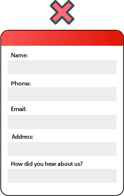
The foundation of form failure often lies in basic design flaws. A single-column layout proves most effective, as multiple columns interrupt the natural flow and confuse users. Furthermore, placeholder text, though common, causes significant usability problems and should be avoided. Notably, studies reveal that reducing form fields from 11 to 4 increased conversions by 120%.
Common Form Pitfalls
- Complex Multimedia Elements: While they may enhance visual appeal, they often introduce friction and learning curves for users.
- Unclear Value Propositions: 41.7% of conversion failures are due to unclear messaging.

Hidden conversion killers
Several subtle factors silently sabotage form performance. Complex multimedia elements, though visually appealing, often create additional friction and learning curves for users. Meanwhile, poorly organized content forces visitors to hunt for call-to-action buttons, leading many to abandon the process entirely.
Gutenberg Principle

- Optimize forms for mobile devices to maintain user engagement and completion rates.
- Ensuring a seamless mobile experience is crucial for capturing a wider audience.
- Forms that lack mobile responsiveness risk losing nearly 50% of potential submissions.
- Poorly Organized Content: Visitors struggle to locate call-to-action buttons, increasing abandonment rates.

The psychology of form abandonment
Understanding why users abandon forms requires diving into their psychological barriers. The risk-reward assessment plays a crucial role - visitors constantly evaluate if sharing their personal information is worth the promised value. Consequently, each additional form field increases perceived risk and decreases conversion probability.
Trust signals significantly impact completion rates. Forms lacking clear security indicators or displaying too many fields trigger anxiety about data privacy. Specifically, studies show that asking for unnecessary information frustrates users and can deter them before they even start.
To combat these issues, consider these critical form elements:
- Clear progress indicators showing completion status
- Immediate error validation without modal popups
- Minimal required fields with transparent explanations
- Mobile-first design principles
The relationship between form complexity and user psychology remains clear: the more effort required, the higher the abandonment rate. By addressing both technical and psychological barriers, forms can maintain their effectiveness without sacrificing valuable data collection.
Essential Elements of High-Converting Forms
Building high-converting online forms requires three essential components that work together to create a seamless user experience.
The purpose of a form must be immediately apparent to visitors. Rather than using generic submit buttons, action-oriented labels like "Get your free book" create more compelling calls-to-action. Moreover, informing users about completion time upfront increases conversion rates, as shorter perceived time commitments lead to higher submission rates.


Trust indicators and social proof
Security concerns drive 17% of form abandonments. Therefore, incorporating trust elements becomes crucial for conversion success. A well-designed form should include:
- SSL certificates and secure checkout badges
- Payment method trust indicators
- Money-back guarantee or free shipping badges
- Customer testimonials and reviews
- Third-party endorsements from industry experts
Research shows that 97% of consumers factor online reviews into their decisions. Primarily, trust badges serve two vital functions: they reassure visitors about data security and align your brand with established names like Visa or PayPal.
Mobile-first design principles
Since mobile traffic now exceeds desktop usage, optimizing forms for smaller screens is essential. A mobile-first approach focuses on creating forms that work flawlessly across all devices. This includes:
Single-column layouts perform better on mobile devices, as scrolling is preferable to horizontal movement. Top-aligned labels help fit content properly on any screen size, while appropriate HTML input modes ensure the right keyboard appears for each field type.
The foundational rule remains consistent - shorter is better. Studies by Baymard Institute reveal that most online services could reduce their default field count by 20-60%. Generally, forms should display only essential fields, with optional ones clearly marked.
For optimal mobile performance, ensure touch targets are finger-friendly and provide clear feedback when users complete actions. Overall, accessibility isn't just about compliance - a form with good accessibility benefits all users, leading to higher conversion rates.

Form Field Best Practices
The Art of Form Simplicity: Less is More
When it comes to form design, the old saying "less is more" couldn't be more accurate. Research shows that reducing form fields 3 to 4 fields led to a remarkable increase in conversion rates. This dramatic improvement highlights a crucial principle: every additional field you add creates another potential point of abandonment.
Think of each form field as a small hurdle your users must jump over. The more hurdles you place in their path, the higher the likelihood they'll give up before reaching the finish line. Additionally, studies show conversion rates drop by 2.5% for every field added beyond 3 fields.

For instance, while knowing a user's job title might be valuable for your marketing team, asking for it during initial signup could deter potential conversions. Consider whether that information could be gathered through post-registration surveys or profile completion prompts instead.
Smart Field Selection Before adding any field to your form, ask yourself:
- Is this information essential right now?
- Can this data be collected later in the customer journey?
- Does this field directly contribute to your form's primary goal?
For optional fields, including the word "optional" next to the field descriptor reduces cognitive load. This approach particularly helps in forms where most fields are required, as it eliminates the need for users to deduce field requirements through comparison.
Real-Time validation techniques
Marking required fields demands careful consideration. Studies indicate users rarely read instructions at the top of forms. Accordingly, explicitly marking each required field proves more effective than general statements about field requirements. Validation should occur as users type, with error messages appearing next to the relevant fields. Error messages must be visually distinct, explain issues clearly, and provide specific correction guidance.
To reduce friction,The traditional approach of using red asterisks has become standard practice, primarily because users understand this convention. However, the asterisk placement matters - positioning it beside the field label helps users quickly scan required fields, enabling users to process information faster.
Poor implementation

Good implementation

31% higher satisfaction ratings
Smart Form Testing Strategies
Systematic testing forms the backbone of successful form optimization. A/B testing, alternatively known as split testing, provides concrete data about which form elements drive better conversion rates.
A/B testing fundamentals
A/B testing involves creating variations of form elements and measuring their impact on user behavior. This methodical approach eliminates guesswork by collecting real-world data about user interactions. Research indicates that organizations missing key testing metrics fail to deliver on 56% of their performance goals.
The success of A/B testing relies on proper sample size determination. Testing requires consideration of statistical power, expected effect size, and data variability. Primarily, this ensures that observed differences between form variations represent genuine user preferences rather than random fluctuations.


Key metrics to track
Form analytics reveal crucial insights about user behavior and conversion patterns. Essential metrics for form optimization include:
- Conversion rate: Measures the percentage of users completing desired actions
- Click-through rate (CTR): Tracks engagement with specific form elements
- Time on page: Indicates user engagement levels
- Bounce rate: Identifies potential form abandonment issues
Indeed, automating measurements proves crucial for optimizing test performance, as it enables teams to gather repeatable test data and scale coverage alongside product complexity.
Essential Form Testing Tools & Platforms
Choosing the right testing tools can make or break your form optimization efforts. Organizations that implement comprehensive testing strategies see a 44% improvement in form performance and reliability.
Here's what matters most:
- Cross-browser and cross-platform compatibility to ensure forms work everywhere
- Detailed analytics and reporting capabilities for data-driven decisions
- Integration with existing CI/CD pipelines for seamless deployment
- Support for both client and server-side validation testing


Top Testing Platforms to Consider
- Buck Up Studio: Comprehensive form optimization and testing, with specialized focus on UX/UI enhancements
- Hotjar: Excellent for heat mapping and user recording analysis
- Optimizely: Enterprise-level testing with advanced segmentation
- VWO: Specialized in form analytics and funnel testing
Best Practices for Implementation:
- Start with standardized testing processes across all forms
- Monitor both immediate and long-term results
- Focus on key metrics like completion rates and error frequency
- Regularly iterate based on test findings
Remember: The most effective testing strategies combine multiple tools to capture both quantitative data (completion rates, error frequencies) and qualitative insights (user behavior patterns, friction points).
Mastering Form Analytics: Turn Data into Conversions
Companies implementing comprehensive form analytics see a staggering 451% increase in qualified leads. Focus on these key metrics: abandonment rate, field completion time, and successful submission rate to understand your form's performance.
Research highlights the main reasons users abandon forms site security concerns, while 37% leave when asked for phone numbers. Armed with this knowledge, optimization becomes straightforward.
Optimization Quick Wins
- Remove unnecessary fields (especially phone numbers)
- Add visible trust signals and optimize for mobile
- Monitor and fix fields with high error rates
Through comprehensive form analytics, businesses can identify patterns in user behavior and develop targeted improvements. Field-level analytics reveal which questions cause the most friction, enabling organizations to streamline their forms effectively. Certainly, this data-driven approach to form optimization proves essential for maintaining competitive advantage in digital landscapes.

Key Takeaways
1.
Building high-converting online forms requires careful attention to design, psychology, and user experience. Data shows that optimized forms can achieve up to 120% higher conversion rates through thoughtful field reduction and strategic implementation of trust indicators.
2.
Success stems from three key areas: clear value propositions that immediately communicate benefits, robust testing strategies that validate design choices, and comprehensive analytics that identify optimization opportunities. Mobile responsiveness stands as particularly crucial, considering that properly optimized forms can boost completion rates by 50% on mobile devices.
3.
Smart form design balances data collection needs with user experience. Rather than overwhelming visitors with numerous fields, successful forms focus on essential information while maintaining clear progress indicators and real-time validation. This approach, combined with proper security measures and trust signals, helps overcome the psychological barriers that often lead to form abandonment.
4.
Businesses that embrace data-driven form optimization and continuous testing see measurable improvements in conversion rates. Through careful attention to user behavior patterns and drop-off points, organizations can create forms that not only collect necessary information but also provide a seamless experience that transforms visitors into valuable leads.