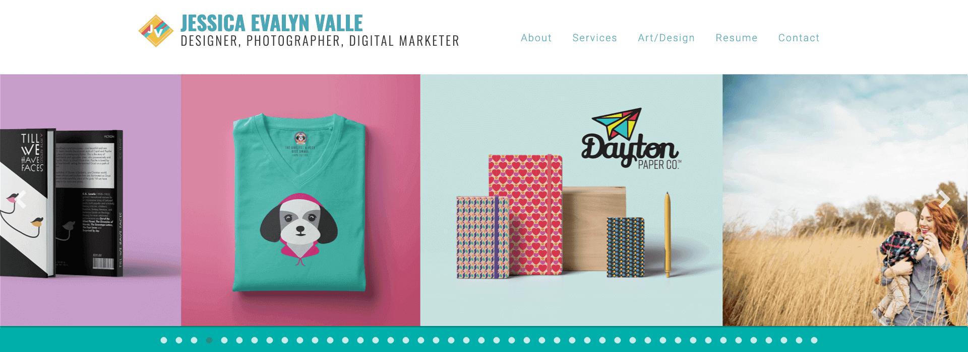
Picture Patagonia's majestic mountain range silhouette, Nike's iconic swoosh, or the Amazon's clever smile. These aren't just logos – they're visual stories that capture the essence of their brands in a single glance. Whether it's REI's outdoor spirit or Apple's elegant simplicity, the most memorable logos share a power to instantly connect with their audience. But what makes these logos so magnetic? Let's explore the art and science of creating a logo that doesn't just exist – it makes a lasting impression.
Why Your Logo Matters More Than You Think
Your logo is like your brand's handshake – it's often the first impression people have of your business. In today's scroll-and-go world, you've got about 0.05 seconds to make that impression count. No pressure, right?
The Psychology Behind Memorable Logos
Before we jump into the tips, let's talk about why some logos stick while others slip through the cracks of our memory. Studies show that the most memorable logos share three key qualities:
- Simplicity: Easy to recognize and remember
- Relevance: Connected to the brand's purpose
- Uniqueness: Distinguished from competitors
1. Embrace Uniqueness (But Keep It Simple)
(Icon: Fingerprint)
Creating a unique logo is about finding that perfect balance between standing out and staying relevant. Your logo should have signature elements that set it apart from the competition while remaining true to your brand's core identity. Just as Mastercard's overlapping circles or FedEx's hidden arrow create distinctive visual hooks, your logo should offer something unique that captures attention and memory.
How to Be Unique While Staying Simple:
- Start with your core values
- Focus on one distinctive feature
- Avoid trending designs that will age quickly
- Test your design in black and white first
2. Master the Art of Simplicity
(Icon: Minimize)
Think of simplicity in logo design as the art of saying more with less. The best logos communicate volumes through minimal elements, proving that sometimes the clearest message is the one uncluttered by excess detail. Consider how brands like Apple and Nike have built global recognition through remarkably simple designs that remain instantly recognizable and timeless.
Keys to Simplicity:
- Use negative space creatively
- Limit yourself to 2-3 colors maximum
- Choose clean, readable typography
- Remove unnecessary elements
- Ensure it works at any size
3. Choose Colors That Speak Your Brand Language
(Icon: Palette)
Color selection in logo design is a strategic choice that can make or break your brand's visual identity. Every color carries psychological weight and cultural significance, making your palette a powerful tool for communication. A thoughtful color strategy, like IBM's trustworthy blue or Coca-Cola's energetic red, can become an integral part of your brand's recognition.
Color Psychology in Action:
- Blue → Trust, stability (Perfect for: Financial services, tech)
- Red → Energy, passion (Great for: Food, entertainment)
- Green → Growth, health (Ideal for: Eco-friendly, wellness)
- Yellow → Optimism, creativity (Works for: Children's products, creative services)
- Black → Luxury, sophistication (Excellent for: Fashion, premium brands)
4. Be Bold (But Stay Legible)
(Icon: Bold)
Making a bold statement with your logo means finding that sweet spot between innovative design and practical functionality. A powerful logo commands attention while maintaining its clarity and purpose across all applications. Consider how Target's simple yet bold bullseye or McDonald's distinctive golden arches make strong statements while remaining instantly recognizable.
Ways to Make a Bold Statement:
- Use unexpected color combinations (that still work together)
- Play with typography in unique ways
- Create custom letterforms
- Use clever negative space
- Incorporate subtle symbolic elements
5. Balance Typography and Visual Elements
(Icon: Layout)
Achieving the perfect balance between text and imagery in your logo is like conducting an orchestra – every element must work in harmony toward a common goal. Think about how brands like Spotify combine their wordmark with a simple yet distinctive icon, or how Google's playful letters stand confidently on their own. This careful orchestration ensures that each component enhances rather than competes with the others.
Tips for Perfect Balance:
- Ensure text is readable at all sizes
- Create harmony between symbol and text
- Consider how elements work separately and together
- Test different arrangements and spacing
- Make sure it works in both horizontal and vertical formats
How to Know If Your Logo Works

- Be recognizable in any size
- Work in color and monochrome
- Look good on any background
- Be memorable after one viewing
- Reflect your brand's personality
Common Logo Design Pitfalls to Avoid
- Following design trends blindly
- Making it too complex
- Using generic stock elements
- Copying other brands
- Overlooking scalability
Ready to Create Your Memorable Logo?
Your logo is more than just a pretty design – it's the face of your brand in an increasingly visual world. Whether you're starting from scratch or refreshing your existing logo, remember that the best logos tell a story while keeping it simple.
Need help creating a logo that makes your brand unforgettable? Buck Up Studio specializes in crafting logos that don't just look good – they work hard for your brand. Let's create something remarkable together.
Contact Buck Up Studio Today → Let's design your memorable logo!